Pearson
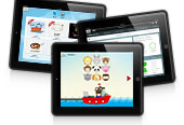
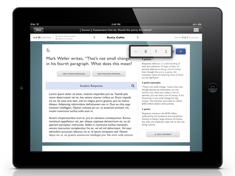
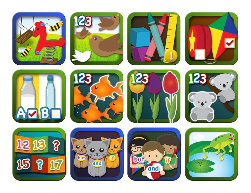
Pearson came to POSSIBLE looking for a solution to modernizing learning in the classroom. The result was two iPad applications containing, lessons, interactives, notebooks and activities that were later ported over to Windows 8 tablets. My responsibilities were concepting, icon design for the lessons, UI design within the app, asset delivery, and QA.
Agency:
POSSIBLE
Project Type:
iPad and Windows 8 tablet Application
Role:
UI Designer
Awards:
Core77 Strategy & Research Professional Winner
IxDA Finalist
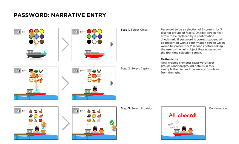
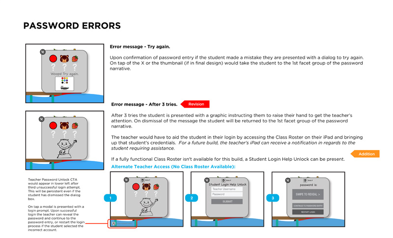
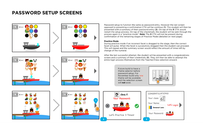
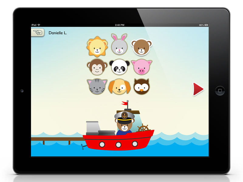
How do you design a learning experience for the United States education system? I was tasked along with a team of multiple UX designers and UI designers to come up with the answer. My primary focus was on kindergarten, though I did assist with 2-12 visual design. Perhaps the most interesting challenge of the whole project was trying to create a login for kindergarteners who cannot read and may not be able to spell their own name.
"Here's why the textbook's days are numbered."
-Bloomberg
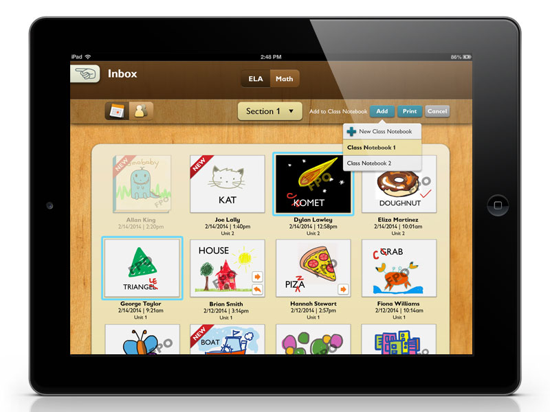
Teacher's View of Student Notebooks
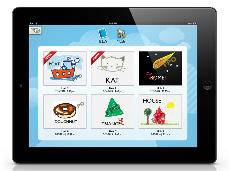
Kindergarten student's view of their Notebook
Kindergarten Login
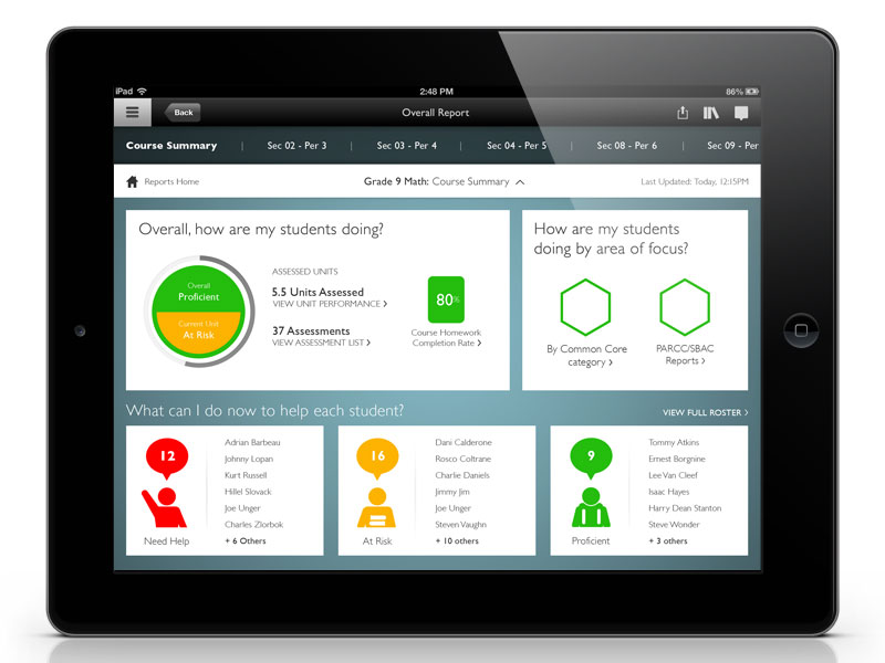
Teacher Dashboard 2-12
Teacher Scoring 2-12
Icons for Kindergarten Lessons
